Tuesday, April 25, 2017

Retail Site Selection

Overview

Trader Joe's is looking to open a new location within Hennepin or Ramsey Counties within Minnesota.  To accomplish this task of figuring out a new location Business Analyst in ArcGIS will be utilized along with customer data that was provided.  Therefore, "blah blah analyst company" was hired to figure out what is going on in the MSP area.  The questions that need to be answered are: What is the Market penetration, where are the ideal customers, ranking three sites, and finally find the optimal store location based on all of the above answers.  Through Business Analyst these questions will be answered and a site selected.

Methods:

There are four main goals to help accomplish this task, these include:

  1. Locate Ideal Customers
  2. Market Penetration Report
  3. Find the Optimal Store Locations/Mean Center of all Consumer
  4. Ranking Sites
The first one to deal with is finding the ideal customers.  This was done using Business Analyst found in ArcGIS.  To do this the Customer Prospecting tool to find regions that have ideal populations and annual income ranges was used.  For the annual income of 60k/yr was used along with a population of less than 65 years of age (Figure 1). 

Figure 1: Ideal Customers map by ranking.  The red  has the most ideal customers, whereas the yellow has the second most ideal customers and the green has the least ideal customers.  
The next step was to solve for the market penetration.  This was also done by using the analysis in Business Analyst to create a market penetration analysis.  This created using zip codes and the customer data that was provided (Figure 2).

Figure 2: Market Penetration data. 
Next, the Optimal store locations/Mean Center of all consumers is created.  This is done through the analysis tool in business analysis using a site analysis.  This is done by choosing the customers layer and having 1 mean center chosen.

Finally, the last step was to geocode three locations that makes sense for a Trader Joe's to move into.  Once these sites are geocoded, the rank markets market analysis can be performed.  This had four variables to go along with it which included 2016 total income, 2016 Median Household Income, Ind: Avg. Spent per Week by HH at Food Stores $150+, and Shopped at grocery store/6 mo: Trader Joe's.  There was also a 1.5 Mile buffer added to each of these (Figure 4). Therfore the best ranking site would be the 3 or dark blue.  
Figure 3: Customers within their area. 


Results

Figure 4: Ranking
 The results that were come up with show that the area in the South Western Region would be an ideal spot to introduce a new Trader Joe's This is located right in Eden Prairie Minnesota where there is going to be a large enough population from the surrounding area making its way to this location due to having a few large cities without a close enough Trader Joe's.  This is also far enough away from the closet Trader Joe's making it not steal customers from the other locations.   Therefore, this location has great demographics for the new store. For these favorable locations it is up to Trader Joe's to come up with which area they could like to expand into along with working with the city to get the best deal they can make.  

Monday, April 3, 2017

Real Estate Analysis

Introduction


Using real estate analysis, our goal is to sell a home that is found within the Third Ward neighborhood of Eau Claire.  This area has prices that extend from $80K to around $700K for the historic homes within the area, therefore determining the fair-house value needs to be accurately based on nearby houses with similar features along with taking into account the house's overall quality.  Simultaneously, the house will need to account for its primary customers to understand the market for this housing option.  


The price is going to be determined based on the following qualities;
  • The location of the house
  • Value of surrounding real estate
  • Features found within the house (# baths / # bedrooms)
  • Recently sold real estate prices


FrontOfHouse.jpg
Figure 1: Front of house
The house being sold is located at 1111 Graham Avenue The amenities of this house are as follows:
  • 4 bedrooms
  • 2.5 baths
  • 1,929 sqft
  • Lot size: 4,356 sqft
  • Single Family
Unique Features:
  • Hardwood Floors
  • Attached Garage
  • Large windows for large amount of light
    Livingroom.png
    Figure 2: Living Room
  • Updated Furnace in 2012
  • Large Living Room


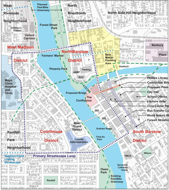
This cozy four bedroom home is located in the Third Ward Neighborhood of Eau Claire, WI (Figure 3).  This house is found an equal distance from the University of Wisconsin - Eau Claire campus and the historic downtown making this house a great location for enjoying parks, downtown shops, and unique restaurants. This home was built a year after World War 2 which finished in 1946 to give this house the beautiful look of the time period giving it American appeal.  This house offers a great location, safety of Eau Claire, and the ability to make house improvements to one's unique style.


Location


QualityofLife.PNG
Table 1
This house is located in one of the historic areas of Eau Claire which has been positioned perfectly between downtown and the university.  It also has an easy access onto the highway about 5 minutes away.  To the east up a larger ridge is more middle-end houses built around the 1960s and 70s, and to the south there is a walking trail that connects a park to the university.  With the larger hill to the east and the main roads cutting a few blocks away this house offers less out-front traffic than other roads within a few blocks, and this house still offers its proximity to downtown while still being a quiet and quaint area.  Some other reasons this location is positive is because there is a high quality of Life located in the City of Eau Claire. By having a 93.9 score of the living index this area is a great place to settle down and buy a home (Table 1).  It is close to two major hospitals, has many hotel rooms for friends and family to come and stay, and if being bought as a property to rent out, it can rent out above the $709 average rental price due to the location of the home.    
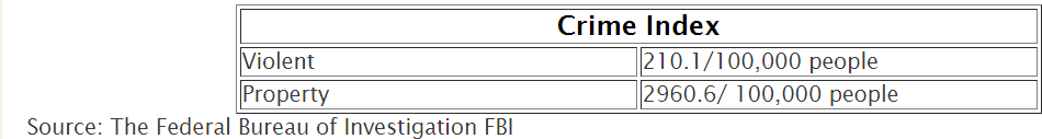
Another reason this is a great location is the crime rate within the City of Eau Claire (Table 2). The crime rate within the City is 210/100,000 people which is low for a city of this size making this a safe place to raise a family and another way to add value to the home.
crimerate.PNG
Table 2
Local Housing Market


The Third Ward has some of the oldest houses found in the City of Eau Claire making it historic and beautiful.  Therefore, most of the housing stock in this area is going to be old and outdated, but still competitive for the area. The houses in the Third Ward will be taken care of better due to
Figure 3: Map of Third Ward.
having less student rentals compared to the area to the Northwest, making this neighborhood  more in demand compared to other neighborhoods at a similar price range. Even with having the oldest houses within the area the average number of defects is less than 2 within the third ward region. This can be compared to the student area housing to the Northwest that has many parcels of defects.  Therefore, the homes surrounding 1111 Graham Ave. show that the neighborhood is maintained and keep their high quality homes keeping housing prices consistent with the area (Figure 4).


Figure 4: Number of Defects found within Third Ward in 2010. 
The Third ward can be divided up into a few different categories of people that live in the neighborhood.  It is rentals, single family homes, duplexes, three or more dwelling units and commercial.   With there being few large rental units except for the ones next to Bracket Hill and the elderly living places which are far away enough for there not to be a noise complaint from that area.  


Demographics

Eau Claire has a population of 67,385 according to the 2015 Census. The Dependency Ratio looks at three different cohorts:


P0-14 = Population in the 0-14 age group, also known as the Youth Dependency Ratio (YDR)
P65+ = Population in the 65+ age group, also known as the Elderly Dependency Ratio (EDR)
P15-64 = Population in the 15 to 64 age group


By using the total population data from the U.S. Census the equation can be written out as:
DR = 100 * (P0-14 + P65+) / P15-64 = (10,849 + 8,221) / 48,315 = 0.39 = 39%


Since the dependency ratio is at 39%, it can be concluded that the working age is more prominent in the city of Eau Claire. If a dependency ratio was high, those of working age face a greater burden in supporting the aging population. In this case, the dependents and the retired make up less of the total population than the working class. The largest age cohort, according to Census Data from 2015, is the 20 to 24 years taking up 15.6% of the population in Eau Claire. Eau Claire is considered a college town due to the University of Wisconsin-Eau Claire. However, people ranging in age from 25-54 also take up a large portion of the population. Eau Claire area is also a great area for families even with the University. There is many opportunities to be taken advantage of in the city ranging from entertainment to large corporation such as JAMF software and RCU headquarters.


Future Development and Attractions

Downtown Eau Claire has been known for their special events to bring people to the downtown. Eau Claire continues to find ways to bring entertainment, recreational, and cultural activities to the city. There is a plethora of indoor and outdoor activities such as music, arts, conferences and shows. These attractions include the L.E. Phillips  Memorial Library, State Theater, Children's Museum, and Boys and Girls Club. Future contributions to the city will include a community performing arts center, The Confluence (Figure 5), as well as a new Civic Center and riverfront parks and trails, considering the Chippewa and Eau Claire River adds a natural attraction to the city layout.
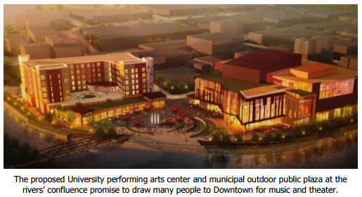
Figure 5: Proposed Performing Arts Center


The value of the riverfront will greatly increase when The Confluence is completed. With the combination between The Confluence and the newly finished Lismore Hotel, other investments in the South Barstow District will be created especially in the 200 and 300 block (Figure 6). The plan is to seek out for new and better restaurants, cafes, and bars in the different areas of downtown.
Figure 6: Image showing future projects.


Eau Claire is also known for it’s many green spaces, including Carson Park, Owen Park, the Chippewa River Trail for biking and recreation activities, and most importantly Phoenix Park where Eau Claire’s famous Farmers Market is held. To continue the diversity of Eau Claire’s green spaces, a small park will be placed by City Hall and the Library (Figure 7).
Figure 7: Future park project. 

Suggested Sale Price


To determine the sale price for this home there are some factors that need to be taken into account.  First, the price of nearby houses that have recently sold that are close in square footage and number of rooms/bathrooms.  Also, the quality of the overall home needs to be taken into the equation.  And finally, what the seller wants to get out of the house.  These variables all factor into the final price.  
Table 3:
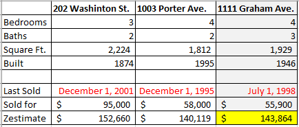
Some of the houses that have recently sold around the area are referenced in Table 3 to understand the estimated price determined for this property.


Based on these factors,the consensus was to value the house at $143,864. The price was decided based on the value of similar homes in the area as depicted above in Table 3.


Sources:

US Census: https://factfinder.census.gov/faces/nav/jsf/pages/index.xhtml


Tuesday, February 28, 2017

Study Areas, Geocoding, Customers, and Trade Areas

Proposition

Two Coffee shops located in San Francisco want to maximize their trade areas in order to benefit both businesses.  Luckily, they were overheard while talking about it and agreed to hire a 3rd party to answer their question.  To do this, a map illustrating where their customers are located, where other coffee/doughnut shops are located, trade areas, and walk/drive times are created into different maps that will help explain the area to maximize their trade areas for each shop.

Methods/Steps

The first step to answer the question was to set up a map to define the two stores customer base and mean store store center.  This was created to show where the two different stores customers are coming from to get to their shop.  With this map the data will show how far the customers are coming from, and if there is any areas where there are cross-overs of where the two stores are competing for.  In Figure 1,  the map shows that there is almost no cross over in where people are going to get their coffee.  There is very few that are closer to the top and head for the bottom shop or the latter, therefore, people are staying closer to the coffee shop near their home.  The Store mean center was produced and added to this map to show where the average middle point of where the customers are coming from.  From this map the mean center is actually very close to the store it self creating an almost equal 360 degrees around the store. The store to the south does have its mean center slightly more north due to the amount of red dots that are seen in the northern store vicinity.
Figure 1:  A map showing the customer base of each store.  The Green is for the store to the north and the red is the store to the south.  The purple and brown dotes are the store mean centers.
The next step was to create a map showing the coffee stores competitors in the surrounding area.  This is done to show what the market is like for both stores, and how close each is to another coffee shop which can be seen in Figure 2. From Figure 2, the store with the most competitors is going to be the northern store.  There is a larger grouping of stores to the east of it creating a larger amount of competition for it.  But, when looking back at Figure 1,  There almost seems to be a large drop off of customers right where the competitors start to pick up in density.  Therefore,  The northern store is not really competing with those competitors as much as the store has the customers around it.  Also from Figure 2, the north store has a lot more competitive market compared to the southern store, and they are not generally competing for the same customers.  

Figure 2:  A map showing the competitors located in San Francisco County. 
  Now,  The next map to create is one for Customer Derived Trade Areas, Figure 3.  This is a map showing where the people are coming from and how much of that customer base is located in that area.  This is important to show because it can tell the viewer where 80% or almost all of the customers are traveling from.  This also shows that there is not much of a competition between the two shops due to not having any cross-over in the trade areas.  The southern store  has a larger trade area due to having less competition making more customers head to that shop compared to the northern store which has more competition limiting their trade area.  

Figure 3:  This map shows the derived trade areas where 80% of the customers are located. This map is important because it shows that there is not a cross-over in trade areas.  
Finally, the last map produced shows the drive/walk time for the distance it would take to get away from the store, Figure 4.  This is important map because it shows how far 0.5 miles, 1 miles, and 1.5 miles away from the store are.  This can help understand if the customers are more likely to walk to the store or if they are more likely to drive.  The northern store will most likely have more walking due to the customer base near the center compared to the southern store which will have more drivers because of the farther distance from the center it makes.  
Figure 4:  This map shows the distance it takes to get 0.5 miles, 1 mile, and 1.5 miles.  Notice that the northern store has a more diamond pattern due to being in a more downtown like district compared to the southern store that is more of a blob due to having weird types of roads run through the area.  

Conclusion

The market for each store is very different.  The northern store (Store 1) has a more dense cluster of people within the first 1 mile of the store (Figure 4).  The southern store (Store 2) has more of a spread out customer base making it have a larger trade area.  Luckily, based on Figure 3, the store do not need to worry much about competing with each other, but need to worry about competing with closer shops, especially store 1 who has more competitors closer to the shop (Figure 2).  Store 2 is in a better position because there is going to be less competition and it covers a larger trade area, but store 1 is also in a good position because there are a lot of people in that are looking to go to coffee shops, therefore they are likely to store 1.  Both of the stores will be sharing trade areas with their competitors, and their customers are mostly people that like to spend money out to eat compared to staying inside.  


Tuesday, February 7, 2017

Population Dynamics in Jacksonville City, FL

Proposition

The company has recently decided to expand into a market located in Jacksonville City, Fl.  There was much debate between the partners on what type of business to sink money into, but it was then decided to use their population geographer on staff to figure out what the population breakdown is in Jacksonville compared to Florida and the United States as a whole.  Comparing Jacksonville City to the state and country level is important to understand what kind of industries will be doing well in the city.  To do this a population pyramid will be created along with the calculations of dependency ration and locations quotients.

Population Pyramid

Figure 1:  A population pyramid showing the percent in the category on the bottom with the age on the side.  
The population pyramid shows a few different ideas that are going on in Jacksonville, Fl.  First off,  There seems to be a large number of people between the ages of 20-29, and then it bumps back out at the age of 45-60.  This currently looks like the baby boom population and their kids making their way though the age gaps.  Therefore, it is not a very high retirement area compared to some of the other parts of Florida that may have a larger population of retirees. There is also not that large of a children population compared to others making it less of a profit coming from children companies. Now, based on the population pyramid the two groups that should be focused on the most will be the four sets of age groups that represent the highest part of the population.  

Next, is to look at the dependency ration.  This is a simple calculation that compares the youth and elderly populations to the population of the working age.  The equation:

 DR = 100 * (P0-14 + P65+) / P15-64

The dependency ration of Jacksonville, Fl is 46.44% and in the State of Florida it is 55.3%.  These were calculated by adding all of the population within the age groups from the equation above and doing the simple math involved.  These dependency ratios show that in Jacksonville Florida only 46.44% of the non-working class relies on the working class, compared to the state of Florida which has 55.3% of non-workers relying on the working class.  This is another point that shows that Jacksonville City has a lower 'retiree and children' population compared to the rest of the state.  

The next step was to fill in the graph below, (Figure 2) to find what kind of populations existed where and to determine the Location quotient from these numbers.  
Figure 2: Table showing the total population, percent population, and the difference between Hispanic population and the total white population. 

Figure 3:  Location quotient of Jacksonville City, County, and State.

The Location Quotient has a few different meanings.  If the number is 1, then it means that it is average for the Country.  If it is above 1 then that area has a larger population of that group.  If it below 1 than it s lower than the average area and group.  The data here shows that Jacksonville has about an average makeup, but at the county level has a very high percentage of people over the age of 65+.  This is interesting because it means people in the surrounding area, outside of the city, may be able to drive into the city to stores, therefore making that a strong contender for what kind of market the business will put money into.  

Finally, the last bit of calculation went into determining the type of service industries (Figure 4).  
Figure 4: Service industries within Jacksonville and State Level.  

This calculation was also done by using the Location Quotient.  With the results there It shows that the financial industry is strong in Jacksonville.  The rest of the industries represent an average area.  

Conclusion

Using the population pyramid, dependency ratio, location quotients of groups or ages, and location quotient based on industry brings the conclusion that the best idea would be to invest in a financial market that involves the population of 20-29 and 45-60.   By using these few estimates it could save the company time and money that would have been wasted in a different industry.